In today’s eco-conscious world, Ozon-Now leads the ozone treatment industry with innovative, top-quality services and a strong commitment to environmental protection. The rebranding project aims to refresh the brand’s image, highlighting its mission and solidifying its market leader status through modern visual communications.
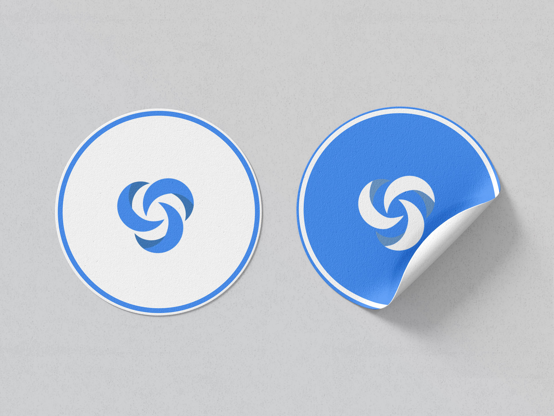
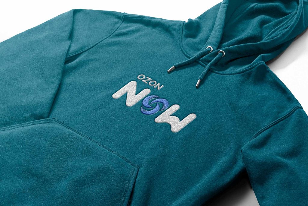
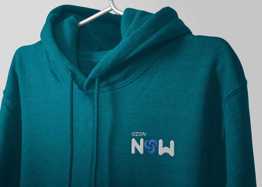
Ozon-Now’s new logo embodies cleanliness, freshness, and high efficiency. Dynamic, swirling forms symbolize ozone’s purifying power, while blue hues represent freshness and black text ensures readability and professionalism. The final logo blends tradition with modernity, promising efficiency, quality, and dedication to Ozon-Now’s clients.
In an era of growing environmental awareness and the search for eco-friendly solutions, Ozon-Now stands out as a pioneer in the ozone treatment industry. With over a decade of market experience, Ozon-Now not only delivers top-quality services but also symbolizes innovation and a commitment to environmental protection and community health. The rebranding project of Ozon-Now aims to refresh the brand’s image, emphasizing its mission and values, while reinforcing its position as a market leader through clear, contemporary, and thoughtful visual communications. The creation of the brand’s new identity is rooted in its history and achievements, which will form the foundation for a dynamic and forward-looking visual identity.
Ozon-Now is a leader in the field of ozone treatment, offering innovative solutions and top-notch services to individuals, businesses, and municipal entities. The logo must convey the idea of cleanliness, freshness, and high efficiency that ozone treatment brings, while also symbolizing the trust and professionalism the company has built over the years.
During the initial sketching process, we focused on the symbol of ozone—dynamic, swirling forms that could represent its purifying power. We aimed to capture the movement and flow that are synonymous with renewal and cleansing, while creating a simple yet powerful graphic element.
In designing with graphic programs, we ensured the swirling ozone symbol was clear and legible. Blue hues were used to represent freshness and cleanliness, while black text provided solidity and readability. Every element of the logo was refined to ensure professionalism and modernity.
The final Ozon-Now logo combines tradition with modernity, conveying the spirit of innovation and the company’s commitment. The blue, swirling element at the center symbolizes the dynamic action of ozone, while the solid black typography ensures stability and a well-established market position. This logo is a promise of efficiency, quality, and dedication that Ozon-Now guarantees to its clients.
ozon-now
service: branding
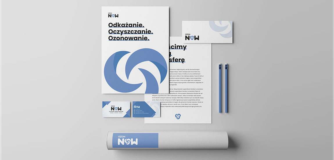
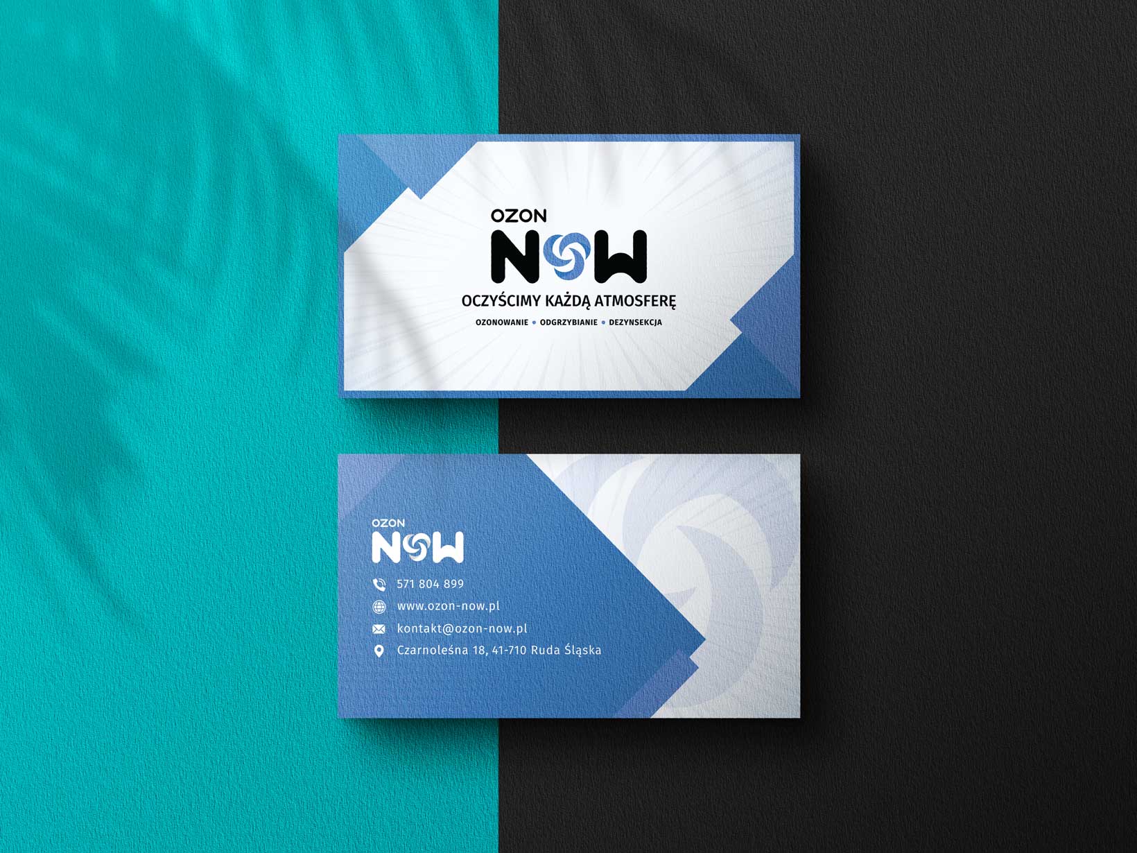
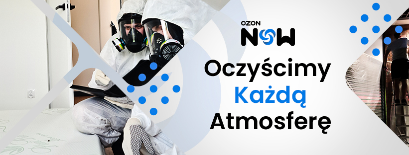
our work: logo, visual key, business card, letterhead, social media
Ta strona korzysta z ciasteczek aby świadczyć usługi na najwyższym poziomie. Dalsze korzystanie ze strony oznacza, że zgadzasz się na ich użycie.ZgodaPolityka prywatności